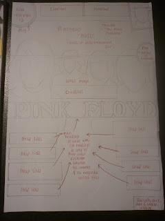
"MOJO" magazine mock up

This is a mock up from "MOJO" magazine - it featured a main image of the international success rock band, Pink Floyd, which clearly linked to the main article within this issue of the magazine. All text was in capitals including the text in the plug was in capitals, especially the lure promoted in the top right of the front cover, giving away a free Pysch CD, which all help to grab the readers attention and make them more willing to buy the magazine. Obviously the typical conventions of every magazine, including a bar code and a mast head were main features on the cover, and a colour scheme of black, white and red. The masthead is black on a white background with the tagline also in white, all in capitals, to ensure that the masthead is a prominent feature and stand out component of the cover. All of the strap lines and main title are all in white with sub text in grey to show the reader the clear differentiation between the main articles featured in the magazine to further grab the readers attention from them being placed on a multicoloured artistic background.
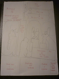
"Q" magazine mock up
This mock up is of an issue of "Q" magazine which primarily focuses on the indie music genre also. A lot of the time when a music magazine is very recognisable and well known, the central image on the cover would overlay the masthead, not worried about the cover up due to it's popularity and established name, however Q magazine, only being one letter, produce this same representation but through the stand out, very unique and trademark bold red box with the white "Q" overlying the tagline. The Masthead "Q" always takes the place in the top left had corner of the cover but always one of, if not the most focused part of the cover, which attracts its target audience of teens to early 20's from this recognised layout and masthead style. I thought this cover was very cleverly thought out as the main image forms a continuation of the main title, inside the word "Gigs" which merges the two and creates a signified relationship between the word and the image of a mass of people in the beaming lights of a music concert/gig. The rest of the main title is delivered/displayed quite differently with a couple of the words being the same colour range as the "Gigs" text, however the beginning of the title starting with "The" is produced in a plain black semi-formal font against the white background. This provides emphasis on the word and with the whole title reading: "The ten greatest gigs of all time", the use of the emphasis allows no room for deliberation and shows that what they (NME), think is right, must be, which may intrigue and attract the target audience, making them want to know what these gigs are. The overall colour scheme is quite basic only really consisting of red, black, white and blue, for the majority, but this draws more attention to huge title making up a third of the cover. However, all of the main features and exclusives of popular artists are encased into gold boxes which will heavily attract people to want to read the magazine, as gold has connotations of expense, wealth and rareity, or in terms of magazine special, unique features/content.


No comments:
Post a Comment