The two main approaches and dominant models/theorists behind what constitutes a sign are;
- Ferdinand de Saussure (1857-1913)
- Charles Sanders Pierce (1839-1914
Saussure's approach concluded of a two-part or dyadic semiotic system. He believed that signs do not represent reality but construct it. He defined a sign as being compiled of a "signifier" (the form in which the sign takes) and the signified (the concept represented). To put it in other words, something which has connotations of something else. Saussure concluded that signs:- both the signifier and the signified, are purely psychological and only make sense in a formal abstract system. He stated that a one word language is an impossibility and that a sign refers to what it is not.

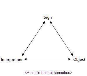
The second approach takes the form of Pierce's triadic semiotic system which states that there are 3 main different types of sign; Indexes, Icons and Symbols. With indexes, the signifier is not arbitrary, but is connected to the signified in some form, either physically or casually. For example the smell of smoke represents fire, yet does not necessarily indicate/signify a fire. Icons have a signifier that resembles signified, for example a drawing or picture of a tree depicts/resembles a tree, however is not the tree in its actual form. Finally, a symbol is when the signifier is totally arbitrary and conventional (numbers and letters).
When creating my magazine I will have to thoroughly take into account the semiotics used in a range of the components on my contents page, double page spread and most importantly my front cover in order for me to attract my target audience. These semiotics will have to be considered with my use of colour for backgrounds and fonts, the images I use, and even with the mise en scene of my photography shoots, as the wrong use of components like this could prevent my magazine reaching the required result. In order for me to do this successfully I will need to think through the eyes of the consumer. A bad combination of semiotics could be for example; if my magazine was of a pop genre, I would not use black shredded fonts or dark red colour schemes to attract my upbeat, party crowd! So in turn, keeping my semiotics appropriate will allow me to appeal to my targeted demographic audience. My chose music magazine genre is Indie/Indie rock and so I will be turning to magazines such as NME and Q for inspiration on what semiotics will be appropriate for my desired audience.
No comments:
Post a Comment