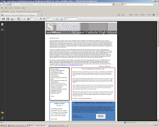
For further research I looked at a second newsletter from a different high school, this time analysing that of St James' catholic high school in Cheshire. From first looking at the newsletter it is clear what the target audience of the publication is and who it is aimed at, parents/carers of the pupils, which most other newsletters tend to struggle with or fail to portray in a professional way. We can see this right from the outset as the newsletter begins with a letter from the headteacher reading "Dear parents/carers", which is instantly addressing the target audience. Also throughout the newsletter, although the font chosen is professional, formal text, there is a lot of it, which may put the parents off reading far down to other articles. The text is also in a fairly small size and so could be hard for people to read, in an attempt to try to fit all of the information on the pages. Although I am not familiar with the school itself, it seems from the website that the school logo and colour scheme is white, gold and mostly navy blue which is not in conjunction with that of the newsletter.
The letter from the headteacher at the beginning makes the newsletter quite formal which is then followed by a prayer (which is a predominant part of their Catholic school life). This is suited to the parents as the text is layed out formally and is very informative. From looking at the screen shot above it looks as if the publication has been produced on Microsoft Publisher with the variation of colour and fonts in cartoonish style boxes. This goes against the professional denotation of the newsletter which can be seen in the screen shots below. You can also see this colour variation and use of childlike format/ image on the second screenshot where red and green text boxes are used and even pink and purple text.
The newsletter includes clip art style images which is very common across many school publications but makes the view unprofessional. To counter this though, it also contains many photo's that look of a high more professional quality although they are a little over exposed on some, which can be seen in the image beneath.
Overall, I would say that this newsletter meets its target audience well with the formality and layout, however there are some features which could be improved to portray a more mature, professional feel. I shall take these points into consideration when designing my own newsletter.


No comments:
Post a Comment