Monday, 29 April 2013

Target Audience evaluations and opinions of my magazine front cover
To get further opinions on my music magazine, I thought that it would be helpful for me to gether the thoughts of who I was aiming my magazine at, my target audience. To display this in a creative and clear way I used "Padlet" to create a wall for teenage girls to comment on my cover, contents page and double page spreas. This post will just focus on my front cover evaluations. I asked my target audience to make notes and record what was appealing to them about "Eclectic" magazine and any things that I could improve on to make it appeal to them more.
I found the "Padlet" programme easy to use and very quick and it allowed me to visually display whether I succeeded in meeting my brief in appealing to my tareget audience of young girls/women of 16-23.
I found the "Padlet" programme easy to use and very quick and it allowed me to visually display whether I succeeded in meeting my brief in appealing to my tareget audience of young girls/women of 16-23.
Saturday, 27 April 2013
Thursday, 25 April 2013
My Music Magazine Double page spread using InDesign FINAL
After planning my double page spread flat plan and a first draft, I got my peers to assess what they thought of my initial draft, and they noticed that I didn't have a bi line which is a common feature in music magazines and so I added one over the top of my main feature image. Also they thought that it would look more appealing with a more creative font for my main title on the page and I agreed, as I wanted to capture the creativeness within the indie genre in my magazine and so I chose a different font that I think turned out well. I also used InDesign to produce my double page spread.


Wednesday, 24 April 2013


Monday, 22 April 2013
Double Page spread Flat Plan for my music magazine

This is my initial flat plan for my double page spread of my music magazine using Microsoft Publisher. I have used NME as a huge inspiration for the majority of my magazine and my double page spread holds a lot of components that may be seen in magazines such as NME. I have decided that I will use one main image as my feature photograph of my main article, my fictional artist 'Elle Nilson'. I came up with this name as the name of my model used in my photographs was name Ellie and so I just slightly adjusted her name to fit a more singer/songwriter image within the indie genre. Filling one whole page of a double page spread it a typical feature that occurs a lot throughout indie magazines and I really like the look of this as it allows one, high quality that represents the artist as a whole. Another convention that I found appealing, which isn't too common, is to have the main title to the article take up around 1/3 of the page with a stand out font. I also included 3 columns of text as I thought that this was an appropriate ratio of image to text on the page, as too much text at the beginning of an article may deter some readers from continuing on, and this structured the page a lot more. To make my double page spread look as professional as possible, I will included a bi line, telling the reader who the photographs were taken by and also a journalist bi line.
I will included the date and page number in the bottom right hand page and bottom left hand page. Another convention that will set up/lead up to the main article of an interview that I will use will be a kicker. Here, the journalist bi line will be mentioned and will tell the audience what they are about to read in a nutshell before going in to further detail to the interview. I plan to only stick to a few stand out colours with the rest of the text on the page remaining black in a serif font to add professionalism to the page. One component that I found really appealing through doing my research was the use of a 'twitter talk' box displaying tweets from the public/audience. I decided to include one of these not only to give the magazine an aspect of realism but it also adds a point of entry to my magazine.
Sunday, 21 April 2013
Contents page Flat Plan

Above is my indie magazine contents page flat plan. I love the clear, precise and artistic layout of the NME contents pages, with each different cover line separated by a single line and a really good balance of images and text and so this is where I found my inspiration for my own (although it may look really confusing from the image above)! I will only use black for the text on the contents page and not highlight certain components with a colour, as this takes away from the simplistic and professional look that is really attractive. The convention that I really took inspiration from, and the only colour for text on the page, is the obvious, in your face page numbers located on each image referring to a certain feature. I like this because it is really easy to navigate your way around the page and you can quickly see what feature is located where by the huge font size. This is also a component that I will use on my own contents page.
Saturday, 20 April 2013
Magazine Front cover flat plan

This is my flat plan for my music magazine front cover. I looked at various issues of the layout for inspiration from NME and combined different components to come up with this layout, however, I got most of my layout inspiration from the Foals issue, which I have previously analysed. I have noticed from my research a few components such as a banner along the top of the page (above the masthead) and a slightly transparent boost/plug with either a cover line or promotion of some kind that NME use quite frequently. I really like the look of this and so I decided to include these components on my own magazine, with the banner displaying one of the main cover lines of a feature within the magazine. The banner will also be displayed using the "rough cut effect" in Photo shop to connotate the artistic feel of the indie genre. The main anchorage cover line on the right of the page will hold the biggest space on the page, with the masthead, to denote and connote its importance. I have included a lot text on the page as I found that when I analysed the likes of NME and Q magazine, although the image was the stand out, eye catching feature and what the audience would be drawn to, they typically included quite a lot of text, highlighted further by a chosen colour (depending on the issue). Leading from this I haven't yet decided on what the whole colour scheme of my music magazine will be, however, I will use the typical red, black, white and stand out colour that complements and contrast my main cover image, as I think that this type of colour scheme is classic and professional looking.
Release form and risk assessment form for Music Magazine
This is the release form that I asked my model (Ellie Bray) to fill out to give her informed consent tot take part in my photo shoot for my music magazine main feature and main cover image.

Below is the Risk Assessment sheets that I filled out to asses hoe safe or dangerous I believed the shoot would be, any possible hazards and how I tried to overcome these through appropriate clothing/footwear etc.


Thursday, 18 April 2013


Tuesday, 16 April 2013
Masthead font choices
After quite a lot of research I have decided that my final magazine masthead will be "Eclectic". Although this title is a lot longer than many indie magazine titles such as NME and Q that are snappy, recognisable names, I have considered that if the magazine were to become more established then it could even be shortened down to just simply "E", like New Musical Express (NME) originally was published as. After I had decided on my title I now just have to choose a font that my masthead will be displayed in. The font of the masthead is really important as it can connote the theme, style and formal/informal manner which may target a different audience than you initially intended, as it is this, combined with the main cover image that attract the demographics.

These are a range of various styles I looked at. They mainly consist of different styles, all within the Sans Serif font range. I did this because after researching a lot about already established Indie magazines, mainly NME and Q, this is the font that they use for their masthead and it looks very professional from its simplicity. This draws attention more towards the main cover image which will be the main and most important feature within the magazine. I then considered that if I were to do the same and make my masthead very simplistic but professional looking, then it would allow me to change the colour, making it look more bold and an eye catcher for the reader. After taking into account these points I have decided to have the second to last one as my masthead font for all of these reasons.

These are a range of various styles I looked at. They mainly consist of different styles, all within the Sans Serif font range. I did this because after researching a lot about already established Indie magazines, mainly NME and Q, this is the font that they use for their masthead and it looks very professional from its simplicity. This draws attention more towards the main cover image which will be the main and most important feature within the magazine. I then considered that if I were to do the same and make my masthead very simplistic but professional looking, then it would allow me to change the colour, making it look more bold and an eye catcher for the reader. After taking into account these points I have decided to have the second to last one as my masthead font for all of these reasons.
Monday, 15 April 2013
Edited final photo for my music magazine: Main cover image


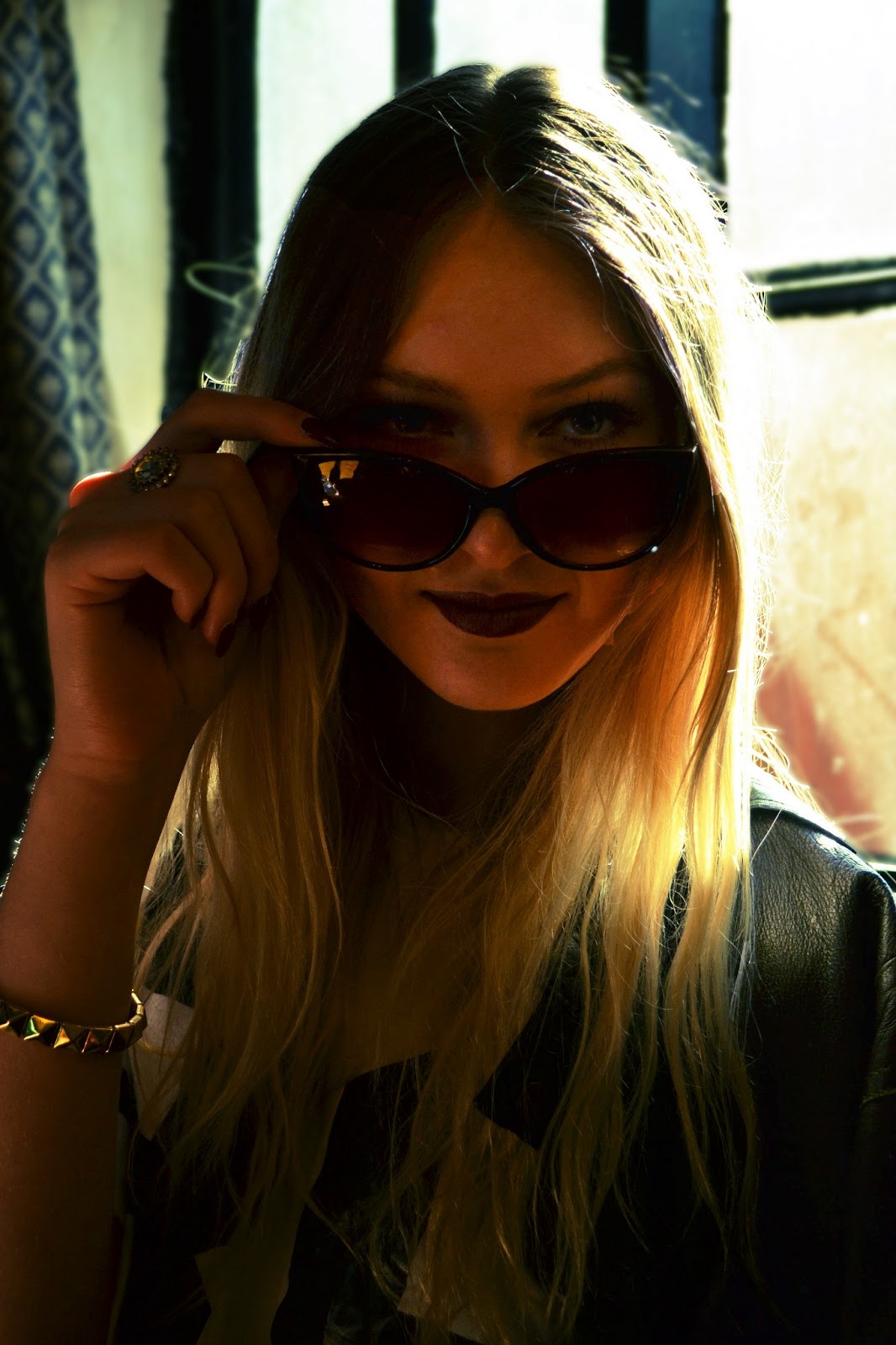
The first image above is the original image that I took in the Scotch Piper pub in Lydiate. The pub itself does not have a lot of light and it tends to be overshadowed a lot of the time and so I tried to capture an image that had a decent amount of light for the photograph. However the seats where in front of the window and so cause a lot backlit which meant that Ellie's face was shadowed and not too clear. This was a component that I tried to overcome when editing my photo. I think a lot of the components in this image work together to portray and capture Ellie's femininity which is why I chose this image as my main target demographic is young women/girls and this should hopefully make the image stand out and be most attractive to this audience.
When editing this photo on photo shop, I firstly increased the brightness and contrast of the image to my desired lighting for it to still look bright enough to see Ellie's facial features, but also keep the vintage depth of shadows and highlights. I then used the curves tool to cross process both of the images above by adding more red/blue undertones to the second image and more yellow/green undertones to the last image above to see which one I preferred. The cross processing gave the images the vintage polaroid effect that I wanted. I then used the spot healing brush tool to remove any imperfections from her skin such as blemishes on her forehead and decreased the saturation and brightness to her lips for a more grungy, dark shade. Finally, I used the clone stamp tool to remove a beauty mark on her neck and little finger in the foreground. From the two images above I will use the last photograph for my main cover image.
Thursday, 11 April 2013
Photo shoot for my Music Magazine
Similar to when producing my school magazine for my prelim task, after creating shot lists of possible images I wanted to take featured on my cover, contents page and double page spread, I actually finally carried out my photo shoot which took place in various locations that I believed reflected the style and naturalistic setting that would appeal to fans of indie genre magazines (explained in blog post about planning for the shoot). I planned the shoot for during 2 week break from school so that I could have unlimited time to take the photographs and also get a variety from more realistic and interesting places than the school grounds! When taking the photo's I used my own DSLR camera to get the highest quality photographs possible with what was available to me to get a professional looking outcome. I tried to think a lot about lighting (back lit, front lit etc) to divert away from over/underexposure in the photo's, even though as you can see below a few of them did not turn out the best quality.

Overall I took 198 photo's on the day which allowed me to have a large range of photographs so that when I came to choose my final images, I had a lot to choose from and made sure that they were the highest quality. I really enjoyed the photo shoot and I am really pleased with how the images turned out and the location and prop choices which brought the photographs together. I found the shoot enjoyable and because I use my camera a lot as I love the quality of the photo's that are taken when I use it, I found it quite easy to get decent images. Despite this, I had a few limitations/problems during the shoot such as the day the photo shoot was carried out was a really sunny, spring day and so I found it difficult at times to find spots outside that provided the right amount of light for a decent photo. Finally, the day I chose probably wasn't the smartest as it was Grand National day, and as the majority of the photographs were shot outside and in a pub (the Scotch Piper), it was difficult to find areas where there wasn't a lot of people becoming objects in the background of the photo's, however if one of my final images includes people in the background that aren't wanted, I can use photoshop while in the editing process to correct this.

Overall I took 198 photo's on the day which allowed me to have a large range of photographs so that when I came to choose my final images, I had a lot to choose from and made sure that they were the highest quality. I really enjoyed the photo shoot and I am really pleased with how the images turned out and the location and prop choices which brought the photographs together. I found the shoot enjoyable and because I use my camera a lot as I love the quality of the photo's that are taken when I use it, I found it quite easy to get decent images. Despite this, I had a few limitations/problems during the shoot such as the day the photo shoot was carried out was a really sunny, spring day and so I found it difficult at times to find spots outside that provided the right amount of light for a decent photo. Finally, the day I chose probably wasn't the smartest as it was Grand National day, and as the majority of the photographs were shot outside and in a pub (the Scotch Piper), it was difficult to find areas where there wasn't a lot of people becoming objects in the background of the photo's, however if one of my final images includes people in the background that aren't wanted, I can use photoshop while in the editing process to correct this.
Tuesday, 9 April 2013
Photo shoot planning for my Music Magazine
I have planned to carry out my photo shoot for my music magazine on the 10th April and organised the day so that I can travel to many locations for a variety of photographs to use for my main cover image, contents page and double page spread. The model I am using is Ellie Bray, who I had previously got to sign a release form for the shoot (see release form post for more details), and I planned for the shoot to start out at Crosby Beach, then travel to the Scotch Piper Pub in Lydiate and finish the shoot at Lydiate Abbey (an old church ruin) and a woodland area next to the pub. I chose these locations because they were fairly natural landscapes and I wanted to portray the realistic outings and natural everyday behaviour/life of my fictional artist. I want to capture the model's girly and grungy sides, but youthful and fun character and to help aid this I will use quite a few props such as a polaroid camera, a lolly ice, a vintage bottle of pink lemonade and possibly a couple of props that I might find in the locations such as seasonal flowers etc. My inspiration for my photo shoot is from the images featured throughout NME and Q of artists on tour and natural shots that show off their individuality.

Monday, 8 April 2013
Analysis of Indie magazine Contents Page: NME (Jake Bugg issue)

Click the link below for my analysis of this NME contents page on Flickr.Hover over the image to view my analysis of each feature/component.
Analysis of Indie magazine Double Page Spread:NME (Jake Bugg issue)

Click the link below for my analysis of this NME double page spread on Flickr.Hover over the image to view my analysis of each feature/component.
http://www.flickr.com/photos/95430599@N04/8702382320/
Sunday, 7 April 2013
Analysis of Indie magazine cover: NME (Jake Bugg issue)

http://www.flickr.com/photos/95430599@N04/8701213557/
Analysis of Indie magazine Double page spread:NME (Foals edition)

Click the link below for my analysis of this double page spread on Flickr.Hover over the image to view my analysis of each feature/component.
http://www.flickr.com/photos/95430599@N04/8701199095/
Analysis Indie genre Contents pages:NME (Foals edition)

Click the link below for my analysis of this NME contents page on Flickr.Hover over the image to view my analysis of each feature/component.
Analysis of Indie magazine cover:NME (Foals edition)

Click the link below for to view my analysis on this NME cover on Flikr. Hover over the image to view my analysis of each feature/component.
http://www.flickr.com/photos/95430599@N04/8702258994/
Initial ideas for cover, contents page and double page spread for my Music Magazine

This is a mind map that I have created with all of my visions on what my music magazine will feature. i have thought about my cover image and images for the contents page and double page spread, along with the colour schemes and possible article features. As my music magazine is for an indie genre, I want to capture the grungy side of the genre through my imagery ad use of fonts and colour scheme, still aiming more towards a female dominant audience. For my images to represent this, I thought carefully about how my fictional artist on my cover image would be dressed and the locations I wanted to shoot at, ad most importantly who would be my model for the images and main feature on my double page spread. I came to the decision of asking my friends' cousin for my photo shoot as her style is very much perfect for the style I originally sought for at the beginning of my research. I arranged a date and chose clothes, props, and possible make up and jewellery that would capture and allow the female audience to relate to the indie/grungy style of the photography.
Subscribe to:
Posts (Atom)