


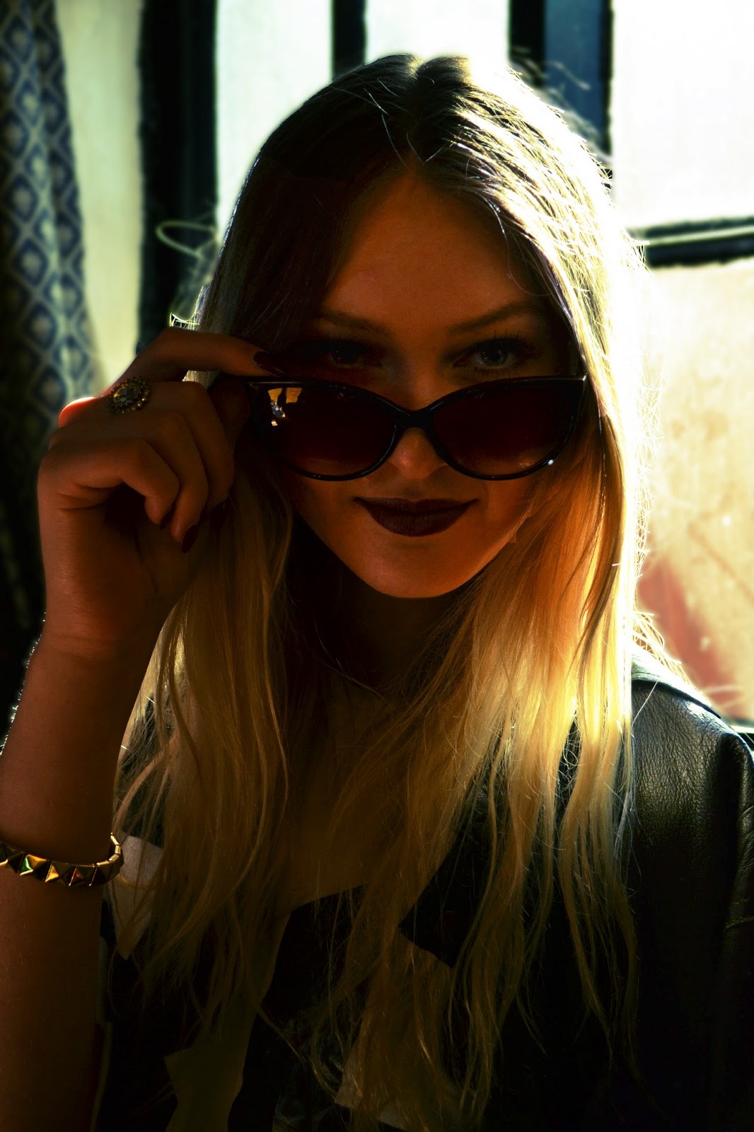
The first image above is the original image that I took in the Scotch Piper pub in Lydiate. The pub itself does not have a lot of light and it tends to be overshadowed a lot of the time and so I tried to capture an image that had a decent amount of light for the photograph. However the seats where in front of the window and so cause a lot backlit which meant that Ellie's face was shadowed and not too clear. This was a component that I tried to overcome when editing my photo. I think a lot of the components in this image work together to portray and capture Ellie's femininity which is why I chose this image as my main target demographic is young women/girls and this should hopefully make the image stand out and be most attractive to this audience.
When editing this photo on photo shop, I firstly increased the brightness and contrast of the image to my desired lighting for it to still look bright enough to see Ellie's facial features, but also keep the vintage depth of shadows and highlights. I then used the curves tool to cross process both of the images above by adding more red/blue undertones to the second image and more yellow/green undertones to the last image above to see which one I preferred. The cross processing gave the images the vintage polaroid effect that I wanted. I then used the spot healing brush tool to remove any imperfections from her skin such as blemishes on her forehead and decreased the saturation and brightness to her lips for a more grungy, dark shade. Finally, I used the clone stamp tool to remove a beauty mark on her neck and little finger in the foreground. From the two images above I will use the last photograph for my main cover image.
No comments:
Post a Comment